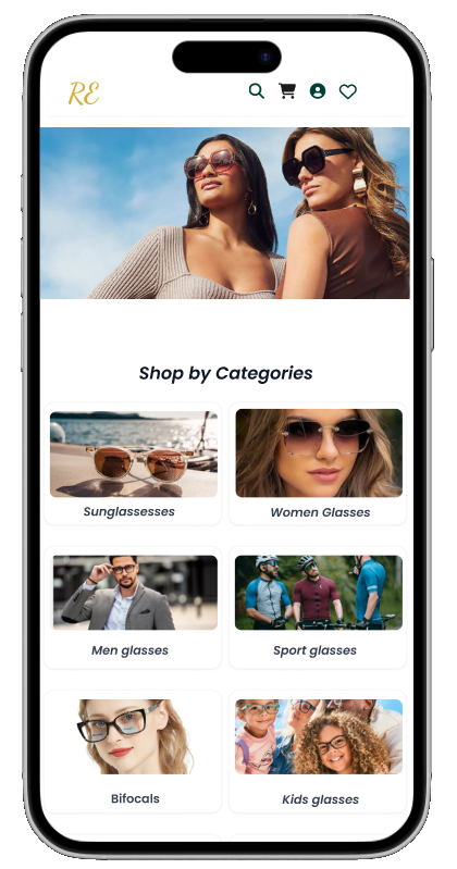
ER Eyeglass mobile app
Project Overview
Product Name: ClearView
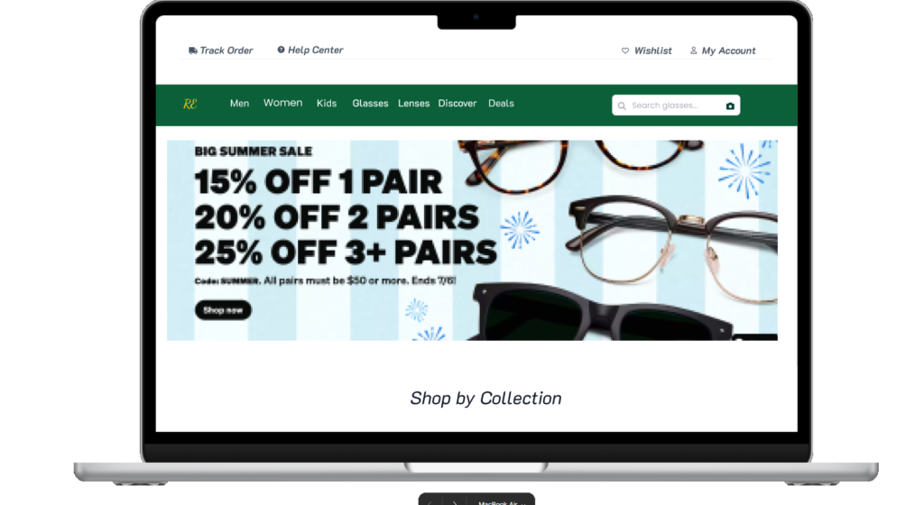
Platform: iOS & Android (Mobile App)
Project Type: UX/UI Design
Duration: 6 weeks
User Pain Points
Uncertainty about frame fit and style without physical try-on.
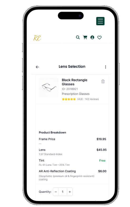
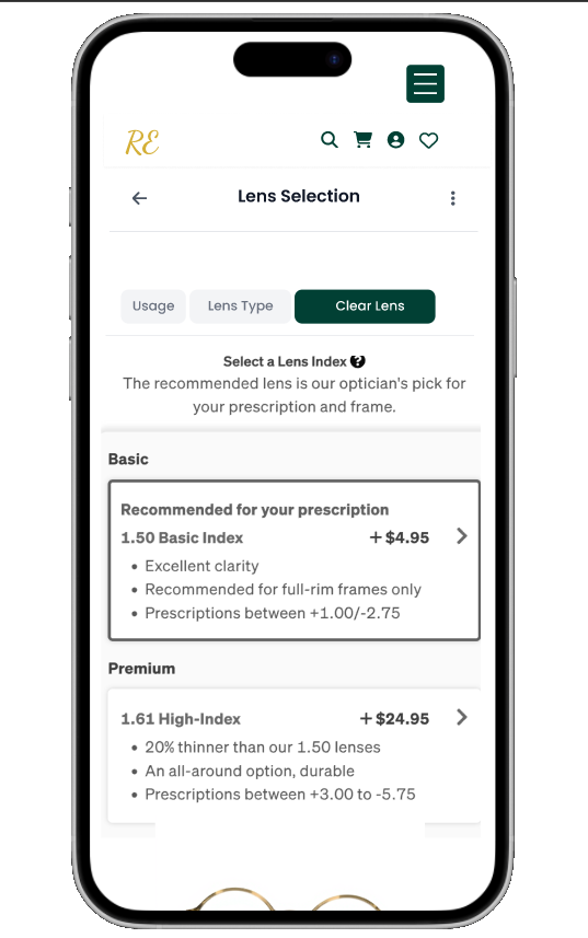
Difficulty understanding technical lens options and prescriptions.
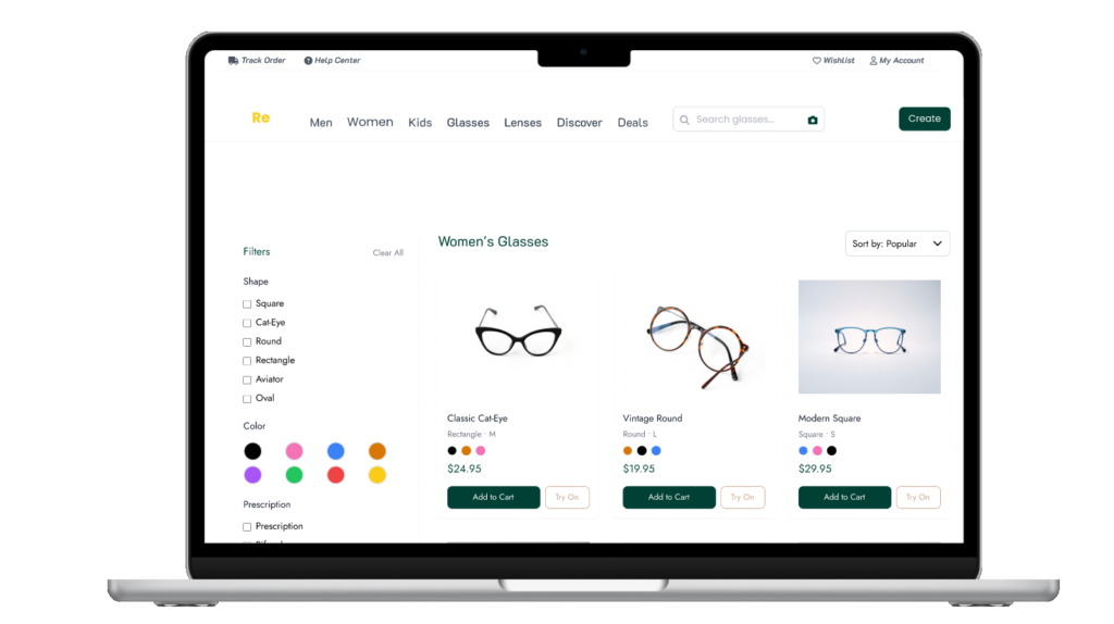
Overwhelming number of choices without personalized guidance.
Complicated return or exchange processes.
Lack of trust in product quality and authenticity.
Poor mobile experience or slow app performance
Key Goals & target Audience
Goal
To design a mobile app that:
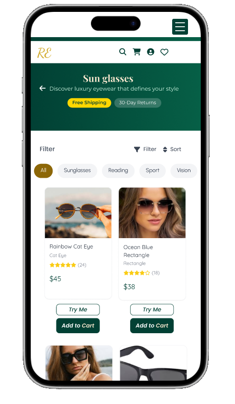
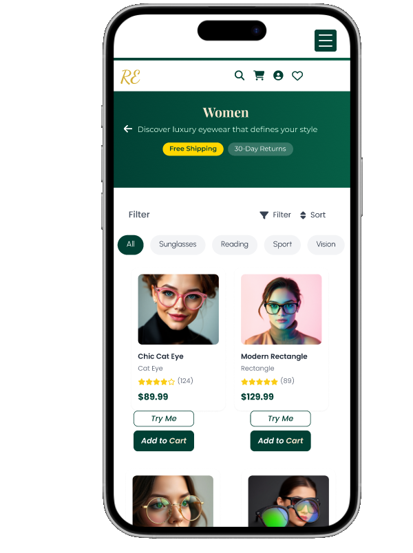
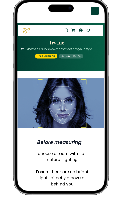
Helps users virtually try on eyeglasses
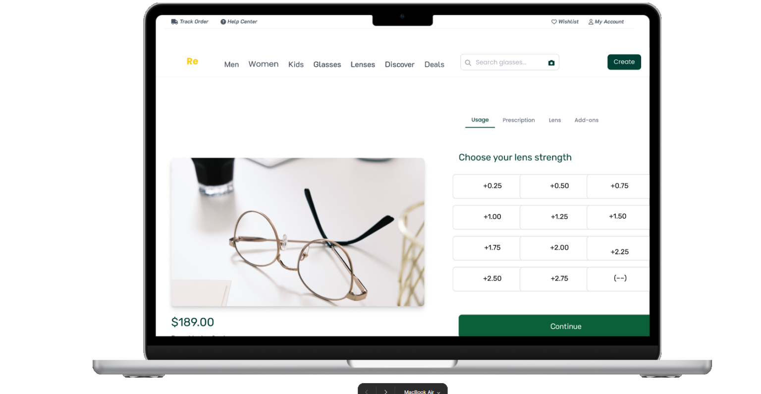
Simplifies the prescription input process
Offers personalized recommendations
Makes the eyeglass-buying experience enjoyable and fast
target Audience
- Young adult who needs prescription ,and fashion glasses
- Budget buyer
Students who want trendy but affordable options
Middle-aged users with specific vision needs and less tech familiarity
Colors used


Research User interview& Survey
Methods:
Online surveys (25 responses)
10 user interviews
Competitor analysis (Warby Parker, Zenni)
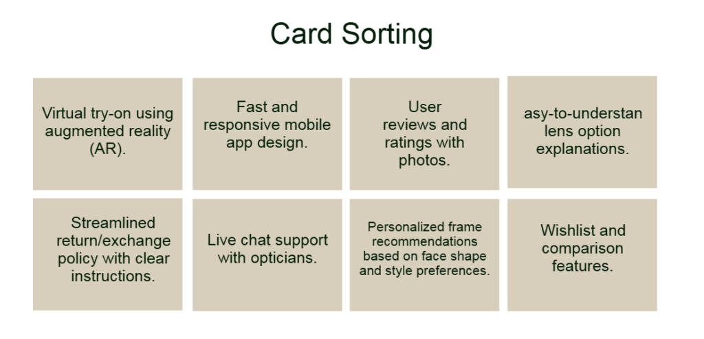
brain sorting Ideas
- Virtual try-on using augmented reality (AR).
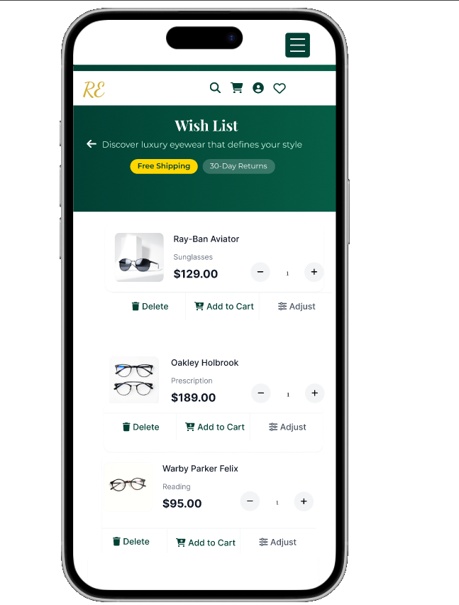
Wishlist and comparison features.
- Personalized frame recommendations based on face shape and style preferences.
Live chat support with opticians.
- Simplified prescription input with guided help.
Fast and responsive mobile app design
User reviews and ratings with photos.
Lorem ipsum dolor sit amet, consectetur adipiscing elit. Ut elit tellus, luctus nec ullamcorper mattis, pulvinar dapibus leo.
Research : Interview & Survey
Qualitative( deep insights into user motivations, fears, and frustrations.)
Interview Questions:
What is your current process for buying glasses?
What frustrates you most about shopping for glasses online?
How do you decide on the right frame style?
Have you ever abandoned a purchase? Why?
What would make the online experience easier for you?
Quantitative
How often do you buy glasses online?
Never / Once / A few times / Regularly
What’s the hardest part of online glasses shopping?
Finding the right style / Prescription input / Price / Return policy / Other
How confident are you in buying glasses online? (Scale 1–5)
Would you use a “Virtual Try-On” feature? (Yes/No)
What feature would make you trust the app more?