Project Overview
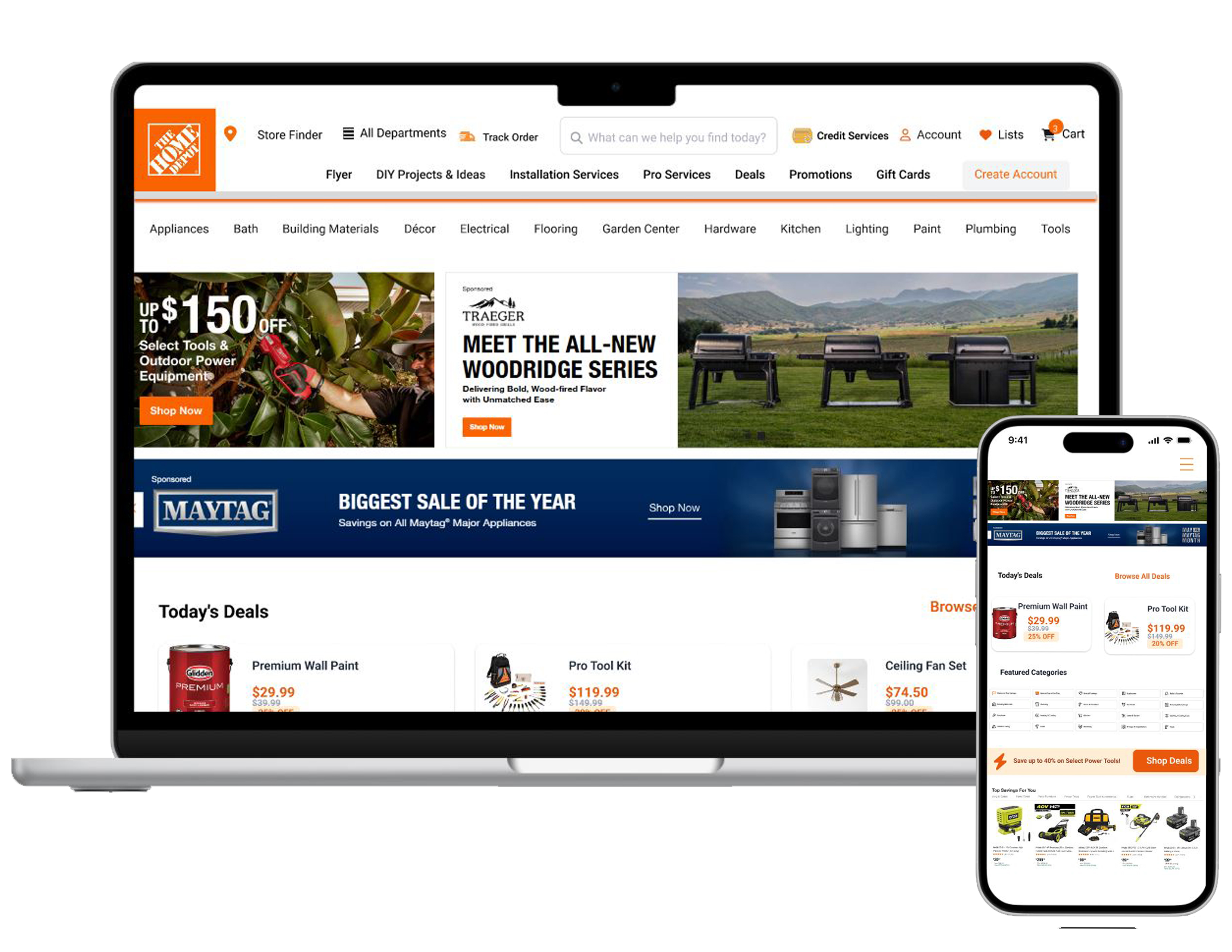
Case Study: Home Depot Navigation Bar Redesign to enhance user satisfaction by addressing key pain points
Client: Home Depot
Project Type: UX/UI Redesign
Role: UX Designer & UI
Duration: 5 Weeks
Tools Used: Figma,Adobe illustlator
Objectives
- Redesign the top navigation and secondary bar to clearly separate product categories and services.
- Keep the top nav and service bar fixed at the top while scrolling for easier access and quicker navigation.
- Design with accessibility in mind, especially for users who struggle with complex interfaces or are unfamiliar with web conventions
- Improve mobile usability with collapsible menus
Users pain points Home Depot App
Usability & Functionality Issues
Poor search discoverability and task completion.
DIY features are hard to find.
inaccurate search results and in-stock info cause confusion.
- unreliable order tracking, and limited shopping list management (can’t edit/delete in-app), its not easy to use
Performance & Stability
Unresponsive Interface
Slow Loading Times/ blank screens
Blank Pages / Unintended Content
Frequent Crashes
- Issues with tablets/foldable phones
Compatibility with Device/OS
Navigation & Filtering Problems
- Filters cause lag, freezes, or crashes when applied in combinations.
- Search results sometimes are irrelevant
Poor Discoverability: Difficulty finding products, services, and departments (especially on mobile).
Performance & Stability Issues
Slow loading, unresponsive UI, blank pages, and frequent crashes.
Device/OS compatibility issues, especially on tablets and foldable phones.
App Crashes & Performance Lag
Several users mention the app freezing or crashing during use.
Performance issues seem more common on older devices or after recent updates
Login & Account Challenges
Email verification codes don’t arrive or loop
Persistent login failures
Prevents access to shopping prefer
The user Research have done by real customers from the Home Depot store
Home Depot App — UX Research
Research Overview
Goal: Identify key usability problems in the Home Depot mobile app and propose improvements to enhance performance, navigation, and overall user experience.
Methods Used:
User Interviews: 10 participants (contractors, homeowners, DIYers)
Surveys: 43 respondents to quantify common pain points
Usability Testing: Task-based testing measuring completion time, success rate, and user satisfaction
UX Research: Interviews questions
How often do you use the Home Depot app for shopping?
What tasks do you usually perform in the app? (searching, filtering, order tracking, in-store locating)
Can you describe a recent frustrating experience while using the app?
How easy is it to find products and their aisle/bay location?
Have you encountered issues with filters? Can you explain?
How reliable is the barcode scanner for finding products?
How accurate is the app’s stock information compared to in-store availability?
Are shopping lists easy to create and manage?
How is your experience with checkout and order tracking?
If you could improve one thing about the app, what would it be?
Survey Questions
How often does the app crash or freeze? (Never / Rarely / Sometimes / Often / Always)
Rate the accuracy of stock information. (1–5)
How effective are filters at helping you find products? (1–5)
How easy is it to locate items in-store using the app? (1–5)
Rate your satisfaction with barcode scanning. (1–5)
How manageable are your shopping lists in-app? (1–5)
How would you rate overall app performance? (1–5)
What device do you primarily use the app on? (Mobile / Tablet)
Do you shop mostly online, in-store, or both?
Open-ended: What features would make your shopping experience easier?