Avea
UX Case Study
Online Shopping
Avea
UX Case Study
Online Shopping
Challenge: Online shopping for beauty products often feels overwhelming due to a wide range of choices, complex navigation, and a lack of personalized recommendations.
Customers require an intuitive, visually appealing, and user-friendly platform that enables them to find products easily, understand their benefits, and make informed purchasing decisions.
My Role: As the founder and lead UX/UI designer of Avea, I spearheaded the end-to-end design process. My responsibilities encompassed:
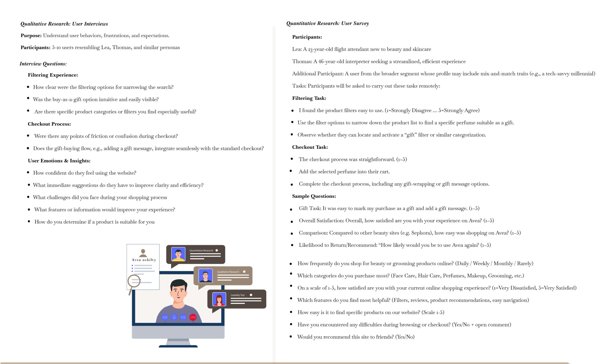
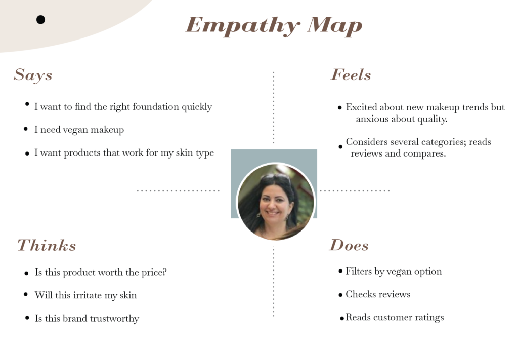
User Research: Conducted in-depth studies to understand user behaviors, needs, and pain points.
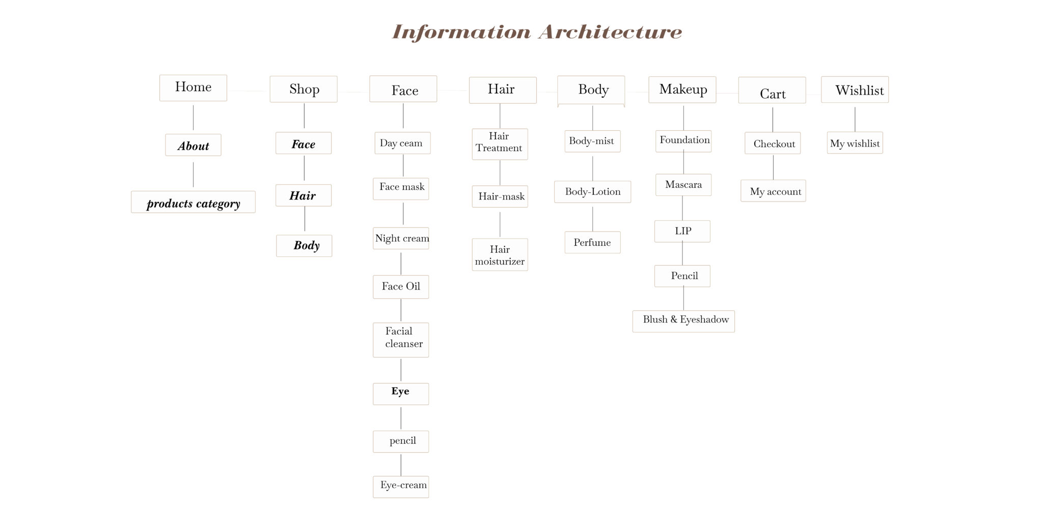
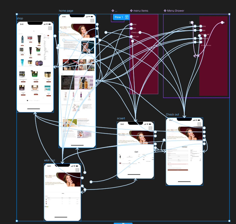
Information Architecture: Structured content to facilitate intuitive navigation and information retrieval.
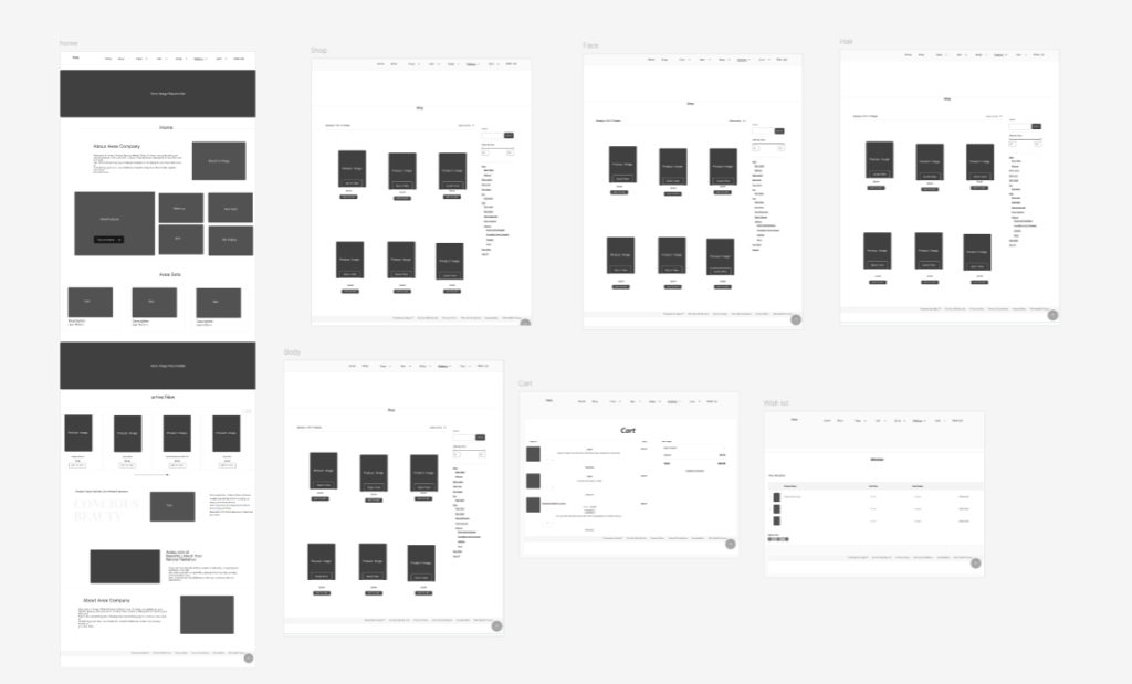
Wireframing & Prototyping: Developed low to high-fidelity wireframes and interactive prototypes to visualize design solutions.
Visual Design: Crafted a cohesive and appealing visual language, aligning with brand identity.
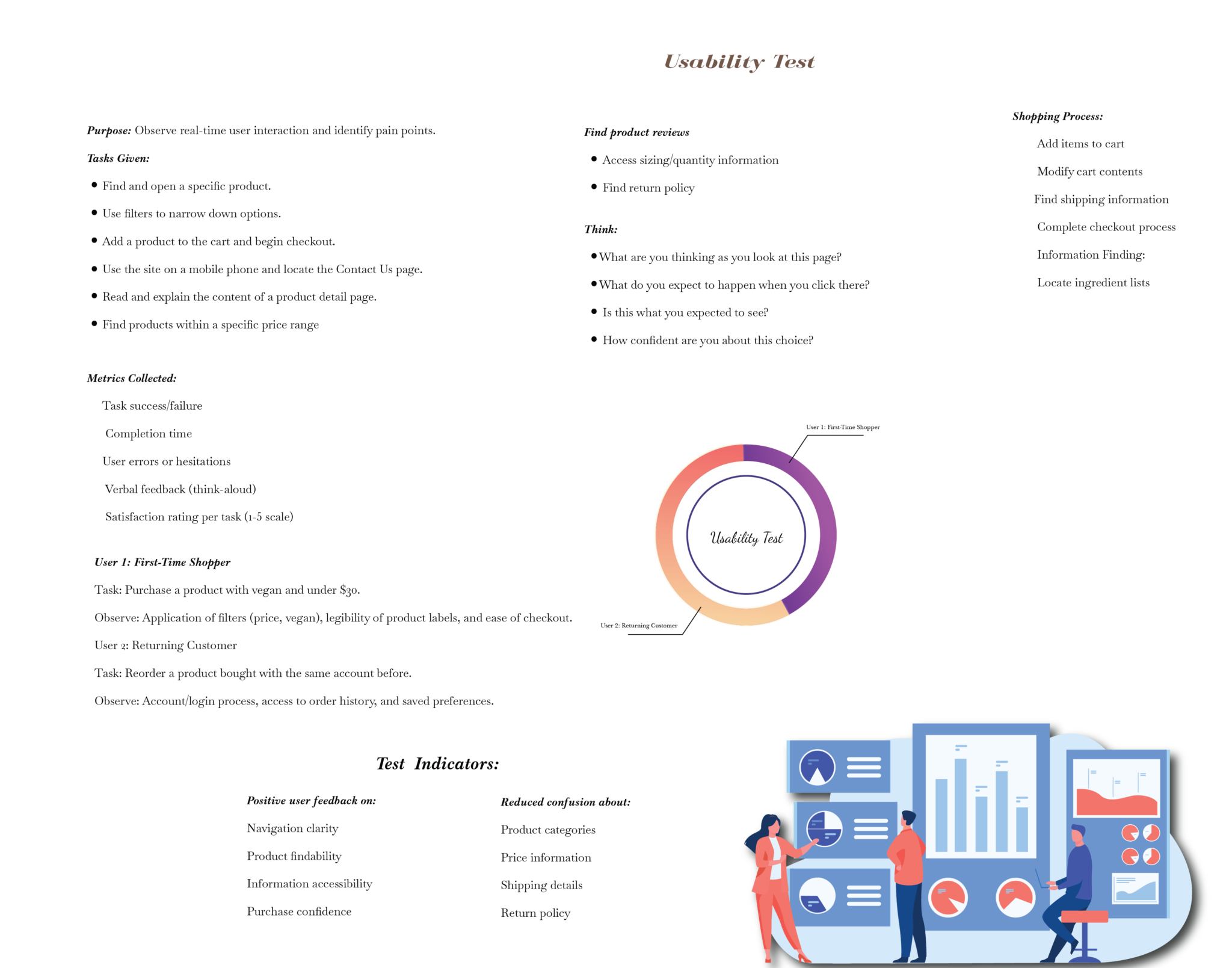
Usability Testing: Implemented iterative testing to refine designs based on user feedback.
Goals:
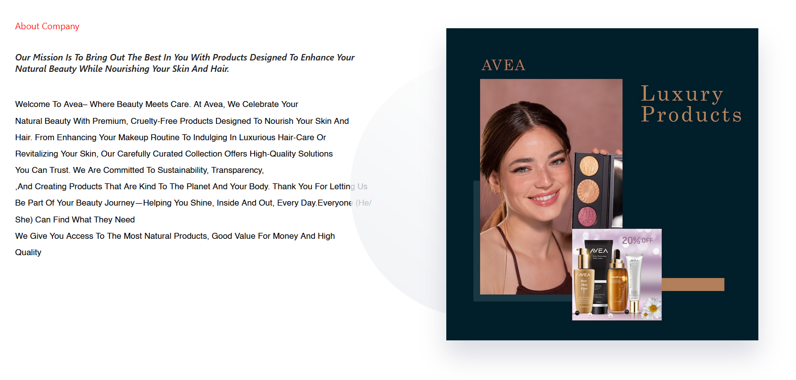
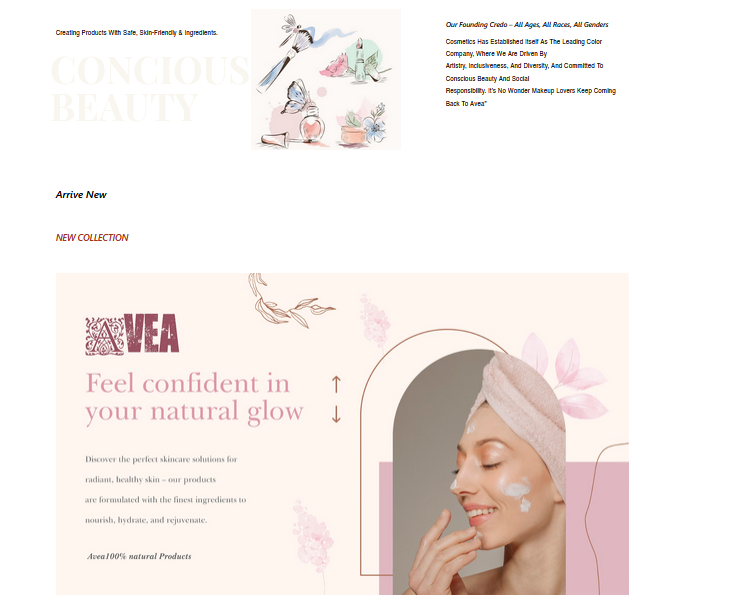
The case study outlines the design of the Avea website for cosmetics, focusing on user experience (UX) improvements aimed at increasing engagement, sales, usability, accessibility, and customer satisfaction. The project aims to create a more intuitive and aesthetically pleasing online shopping experience, optimized for a wide range of users.
This website is not for a real company. The project for showing my roles as web, graphic, and ux design
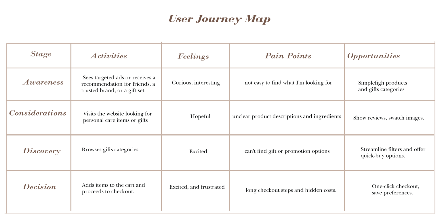
User interviews offer in-depth, qualitative insights into user behavior, revealing pain points and motivations behind actions, especially in areas like shipping and checkout. Surveys complement this by providing scalable, quantitative data to uncover trends, prioritize user needs, and guide data-driven improvements.
| Feature | Ulta Beauty | MAC Cosmetics | Avea |
|---|---|---|---|
| Usability | High – Robust navigation, extensive categories, quizzes. | Moderate – Sleek UI, intuitive navigation, product suggestions. | Low – Basic layout, simple navigation, inconsistent categorization. |
| Accessibility | Basic support (alt tags); some improvement areas. | Strong focus – offers assistive tech and inclusive features. | Lacks accessibility tools or compliance evidence. |
| Search Function | Prominent search bar, predictive suggestions. | Search includes trending keywords. | Very basic search; no predictive features. |
| Mobile Optimization | Fully responsive, fast-loading, mobile-first design. | Mobile-optimized with AR try-on feature. | Responsive, but some UX issues on mobile. |
| Guest Checkout | Yes – Allows guest checkout, promotes account signup via perks. | Yes – Guest checkout supported; loyalty for registered users. | No – Requires account to complete purchase. |
| Subscription / Loyalty | Ulta Rewards® with points, perks, and gamified levels. | M·A·C Lover tiered loyalty system. | None evident. |
| Filtering & Sorting | Advanced filters (brand, price, rating); various sort options. | Standard filters by product type, some sorting options. | Minimal filtering and sorting available. |
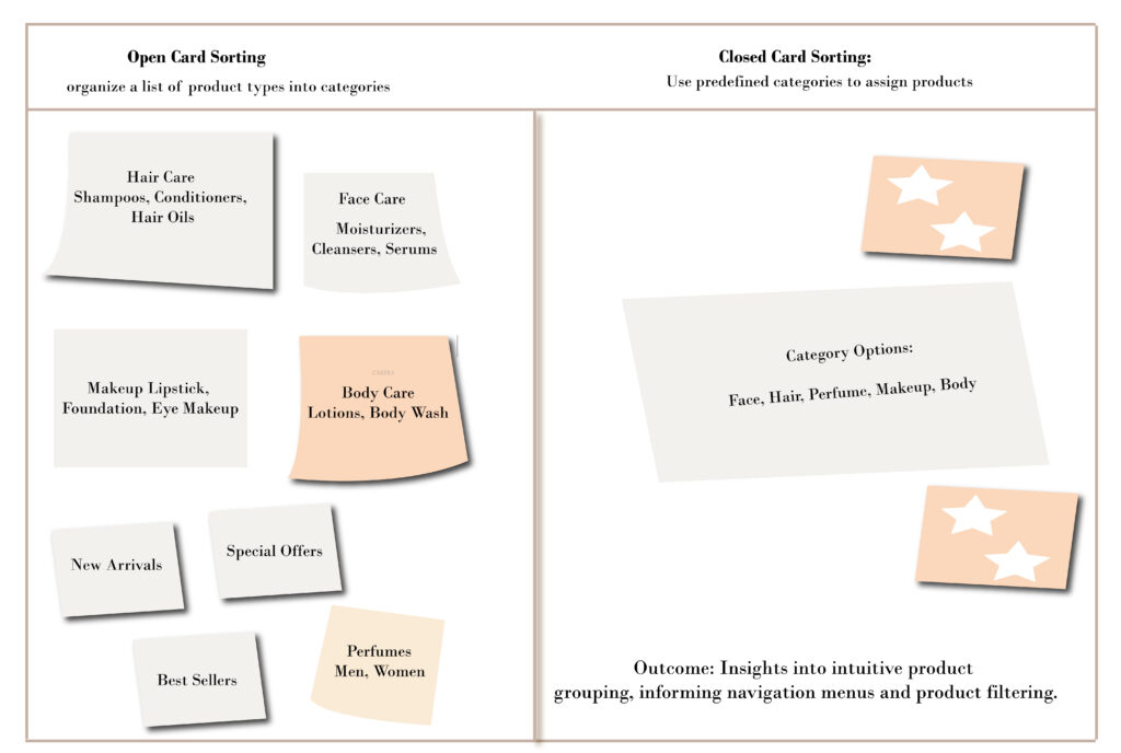
The categorization of products—hair, skin
care, perfume, and makeup—need to be
clearly defined. Overly nested menus or
Inconsistent placement of key interactive
Elements can frustrate users
The categorization of products—hair, skin
care, perfume, and makeup—need to be
clearly defined. Overly nested menus or
Inconsistent placement of key interactive
Elements can frustrate users
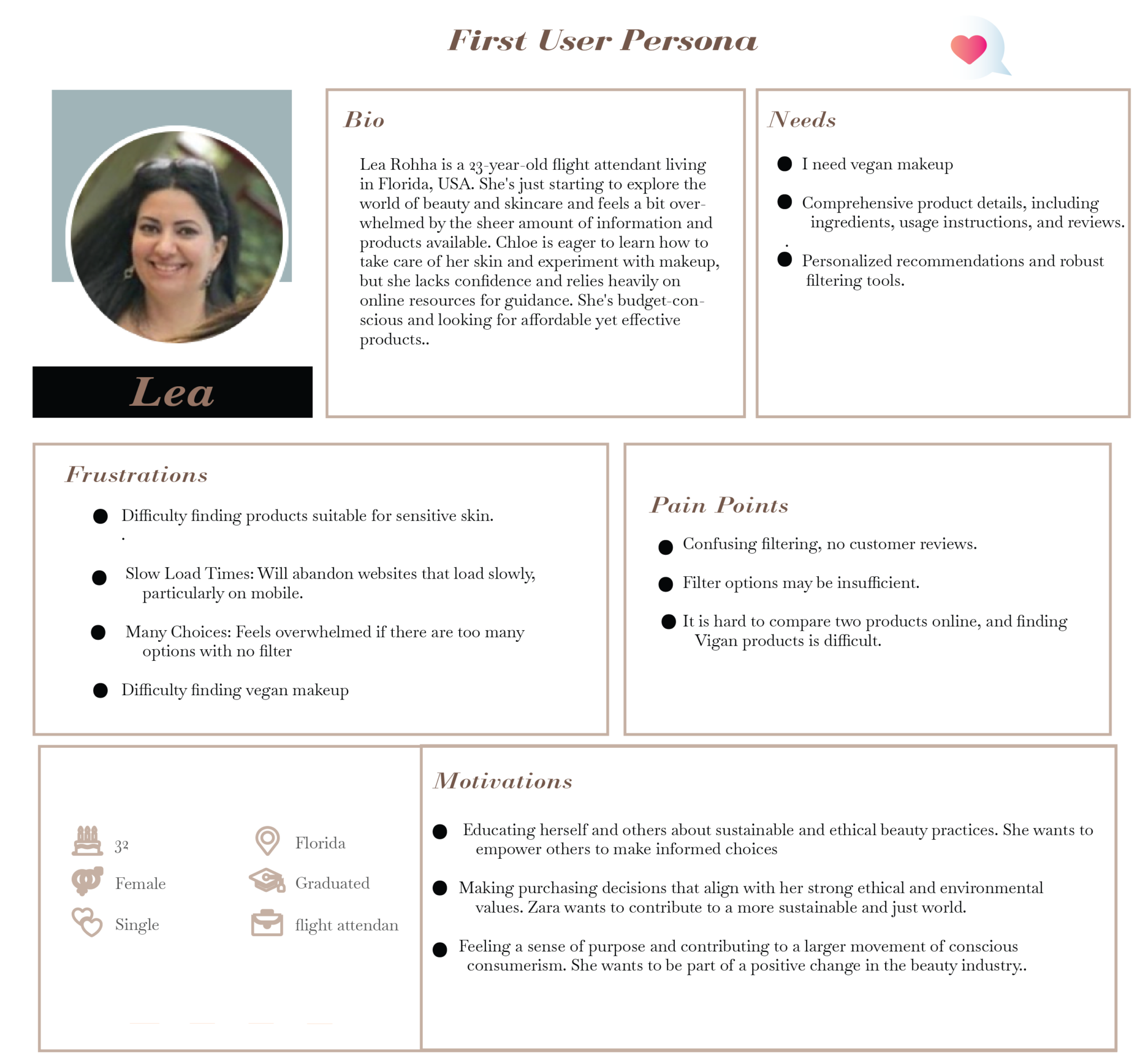
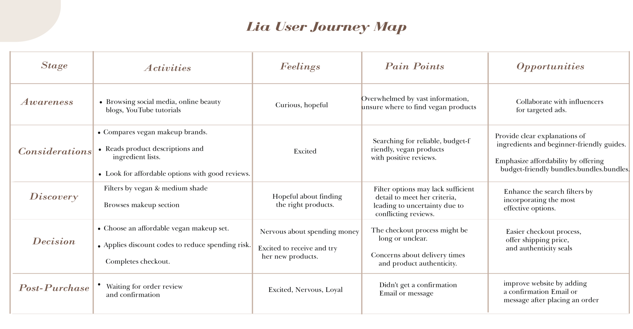
A website claims to cater to a wide range of dietary needs but lacks vegan-friendly options in its product catalog. This makes it difficult for vegan customers to shop for their specific needs.
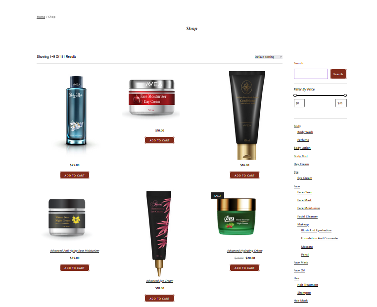
2 . Filter Usability:
Category Filters:
The sidebar category filters (e.g., Day Cream, Body Wash) appear as a long vertical list, which users found unclear. They expressed that the filters would be more convenient and accessible if they were better organized or grouped more intuitively.
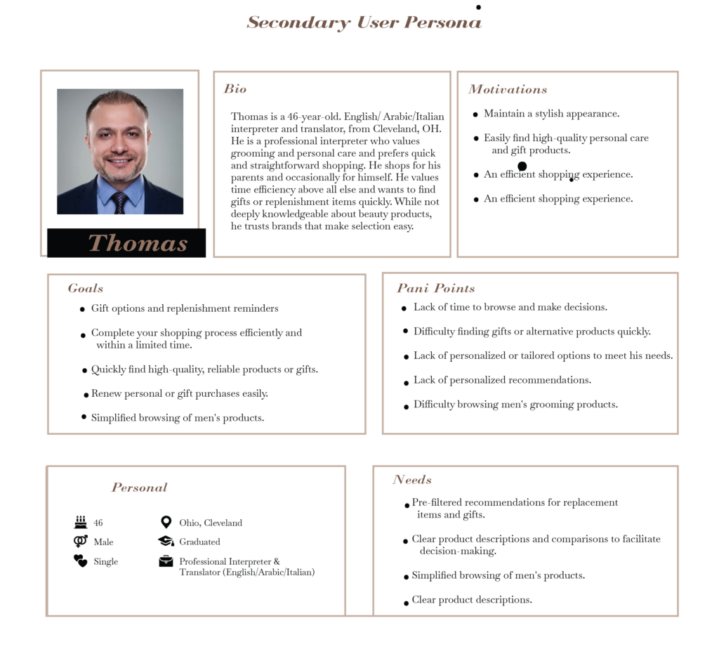
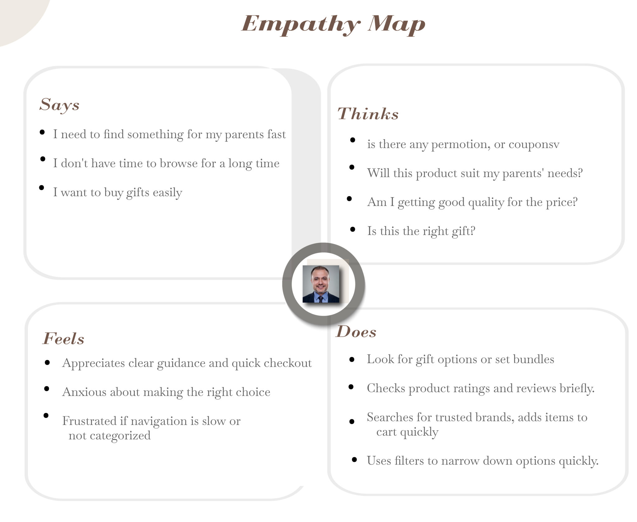
frustrating customers who struggle to find the perfect gift, leading to abandoned carts and missed sales
3. No Loyalty Program Integration, also the Checkout Process is not offered:
4. Not Having Swatches causing
Problem: Customers can’t visualize the product as they would in a physical store. For instance, they may see a red t-shirt on the product page, but they can’t be sure if it’s a deep crimson, bright scarlet, or muted red. This leads to confusion and hesitation.
Problem: Customers with color blindness or visual impairments may have a hard time distinguishing between similar-looking colors or patterns without swatches, leaving them frustrated or unable to shop effectively

Implement alt text, keyboard navigation, and ARIA roles.
Follow WCAG 2.1 standards to ensure exclusivity.
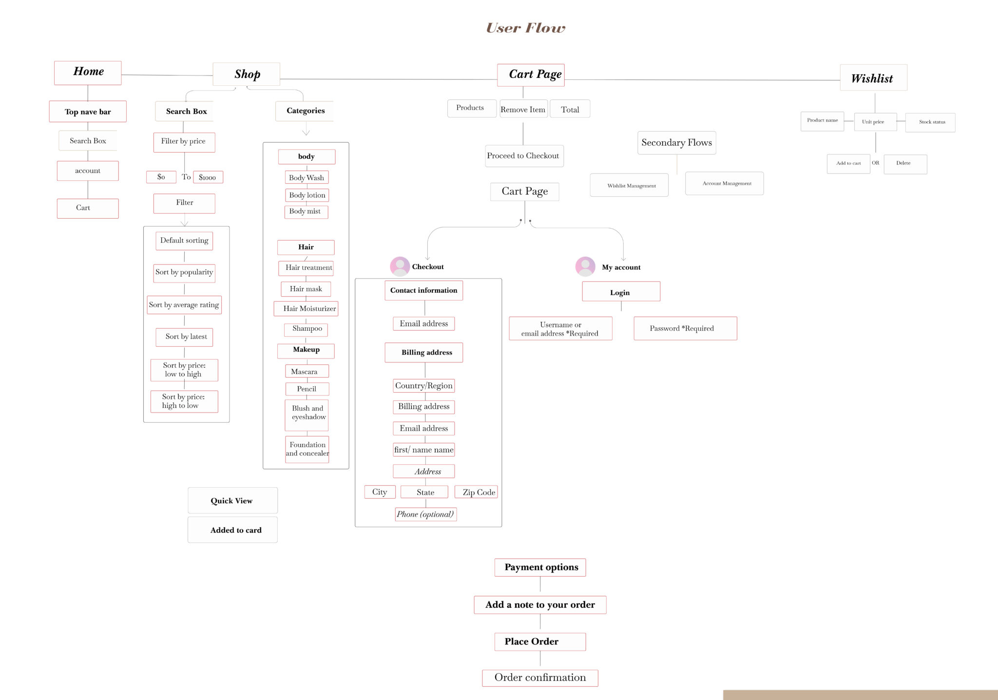
Add predictive search and recent/popular terms.
Filter directly from the search results page.
Always offer guest checkout to reduce drop-offs.
Encourage account creation post-purchase with reward prompts.
Not every customer wants to create an account on a shopping website. In the e-commerce industry, it is crucial to understand the urgency of buying; therefore, guest checkout is extremely important.
Impact: reduce the cart abandonment rate. You must add a guest checkout option so that the customer stays on the page and does not exit it. Doing it will drastically improve the results and reduce the friction
Launch a basic reward system with discounts, tiers, or early access perks.
Display active filters as chips above the product grid. This provides users with a clear view of their current selections and allows for easy removal or modification.
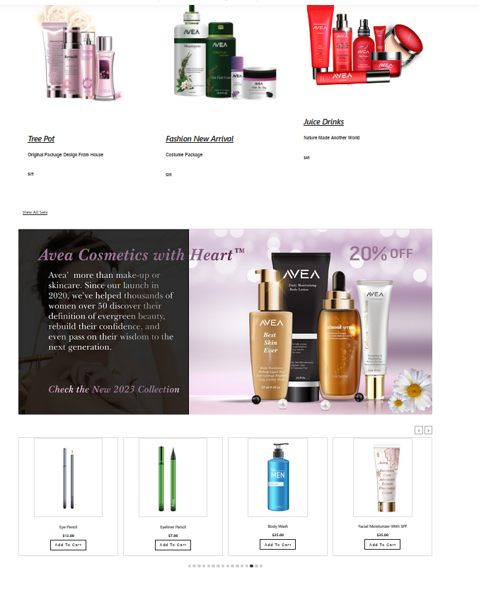
Impact: With the right filters and a clear filtering interface, users can narrow down a product list with thousands of generic products to only
a few items relevant to their unique needs and interests. Solid sorting features enable users to order products by the attributes they care about, something that can dramatically speed up the user’s product exploration and selection process. A balanced product list design provides
users with a better overview of the products available and helps them make a more informed evaluation of which items to engage with
(and which they can safely skip).
Include video demonstrations or product usage tutorials
Show product texture and product usage on different skin types
Videos provide visual and step-by-step guidance on how to use products, with clarity, and remove any confusion. Instruction alone might cause.
Provide Product Reviews and Comparisons
Offer honest reviews of skincare products, comparing their efficacy, ingredients, and suitability for different skin types.
This helps readers make informed purchasing decisions and positions your blog as a reliable source of information.
Solution:
Lorem ipsum dolor sit amet, consectetur adipiscing elit. Ut elit tellus, luctus nec ullamcorper mattis, pulvinar dapibus leo.
Solution:
Lorem ipsum dolor sit amet, consectetur adipiscing elit. Ut elit tellus, luctus nec ullamcorper mattis, pulvinar dapibus leo.
Faster & Smoother Checkout: Users completed purchases 35% faster due to simplified steps and guest checkout.
Reduced Cart Abandonment: A cleaner interface and transparent fees helped drop abandonment by 46%.
Higher Mobile Conversions: Improved mobile UI nearly doubled conversions.
Increased Loyalty: Users are more likely to return, driven by improved UX and a newly added rewards program.