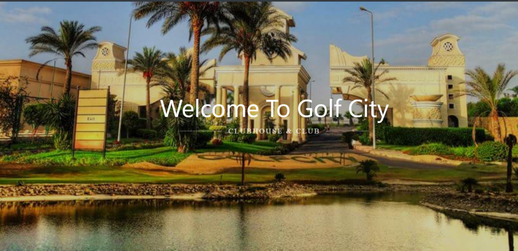
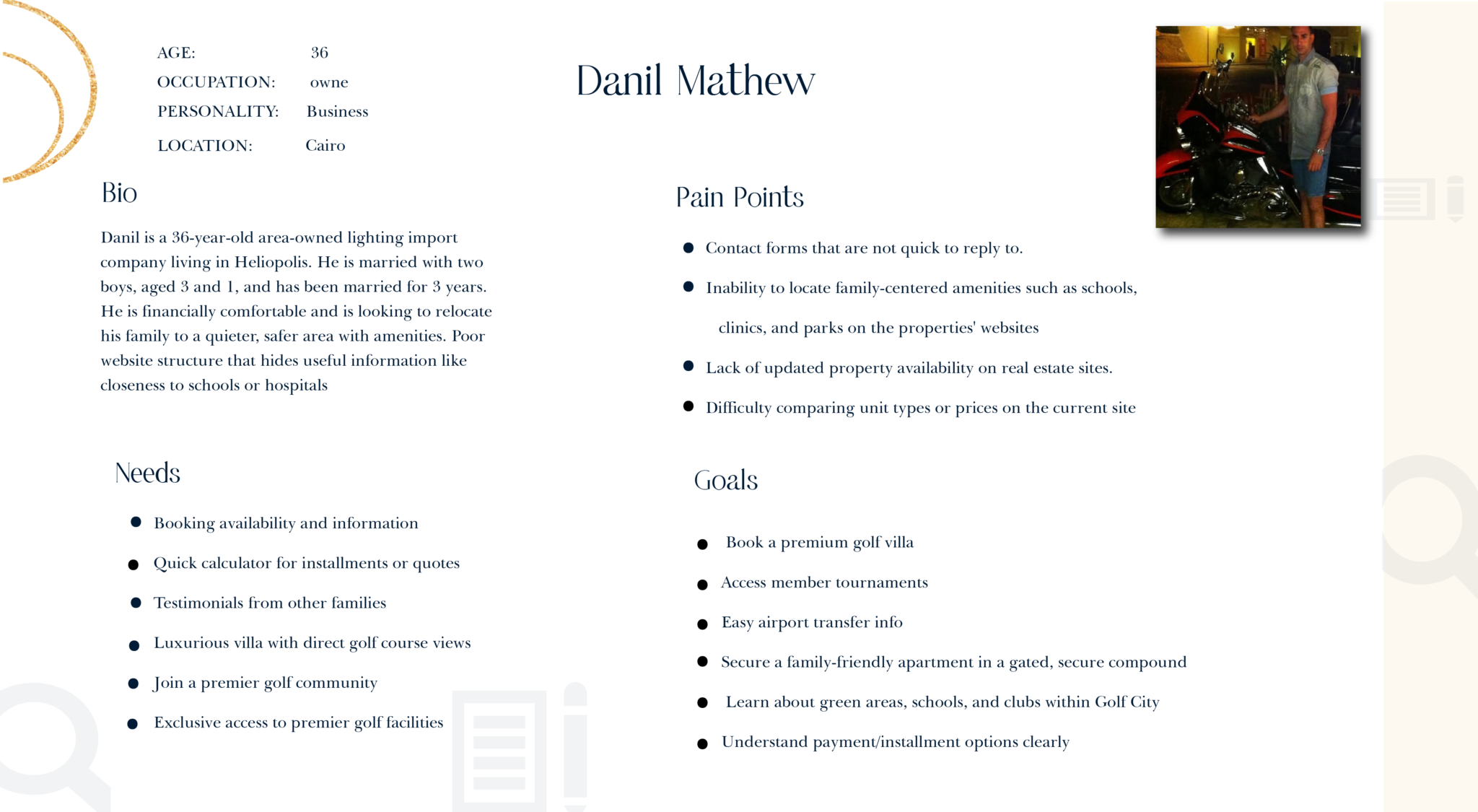
Golf City
Case Study
ux CASE STUDY
UX
Golf City
Case Study
ux CASE STUDY
UX
Add beautiful boxes with title, image and button and encourage users to take action.
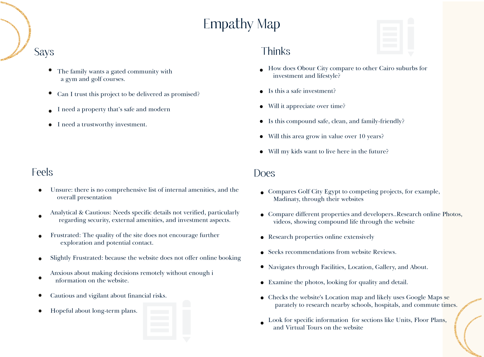
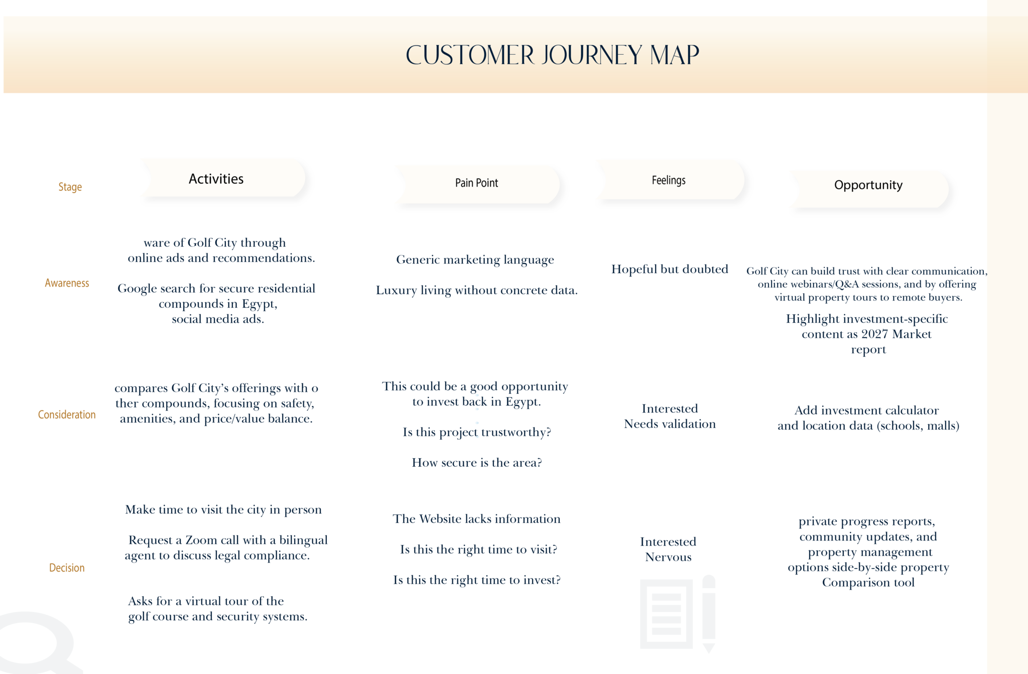
Despite being functional, the website had significant issues with navigation and lack of clear, comprehensive information. Users found it difficult to navigate the website, and essential details, such as course information and booking instructions, were buried in an unclear structure. The goal was to redesign the site to enhance navigation, accessibility, and information presentation to improve user satisfaction and engagement.
Develop a fully customized website from scratch using HTML, CSS, bootstrap, and JavaScript, ensuring a seamless, responsive, and engaging user experience
| Week | Phase | Activities |
|---|---|---|
| Week 1 | Discovery & Research | – Stakeholder interviews- Define goals and target users- Competitive analysis- Heuristic evaluation of current site |
| Week 2 | User Research & Analysis | – Conduct user interviews or surveys- Create user personas- Map user journeys- Define main pain points |
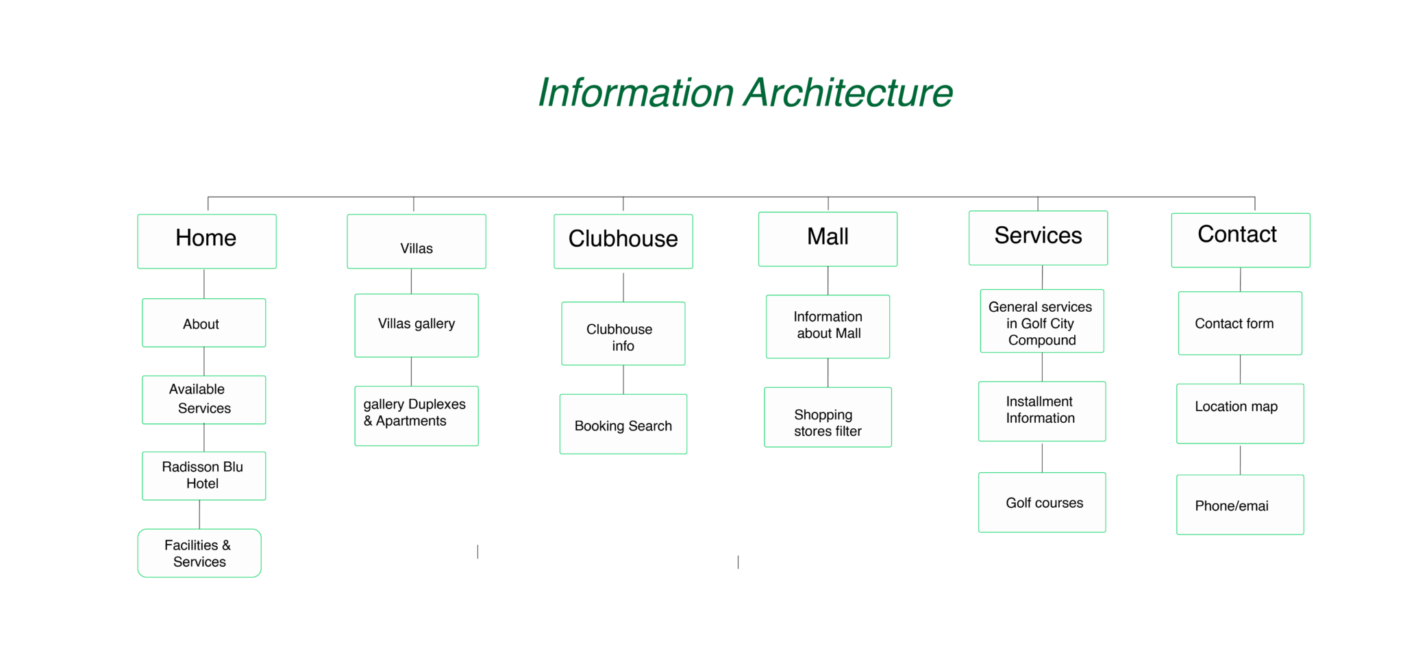
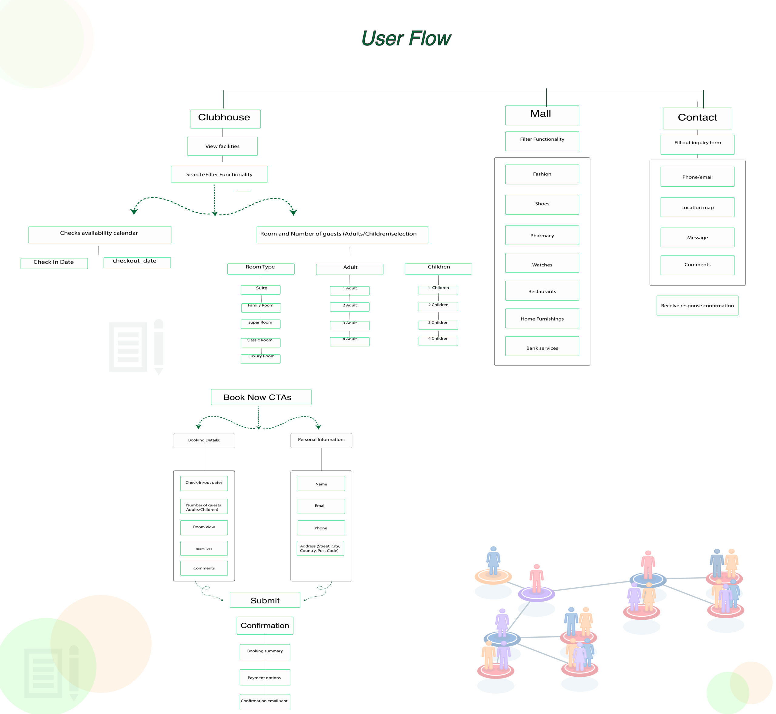
| Week 3 | Information Architecture & Wireframes | – Define sitemap and navigation structure- Sketch wireframes (desktop & mobile)- User flows for key tasks |
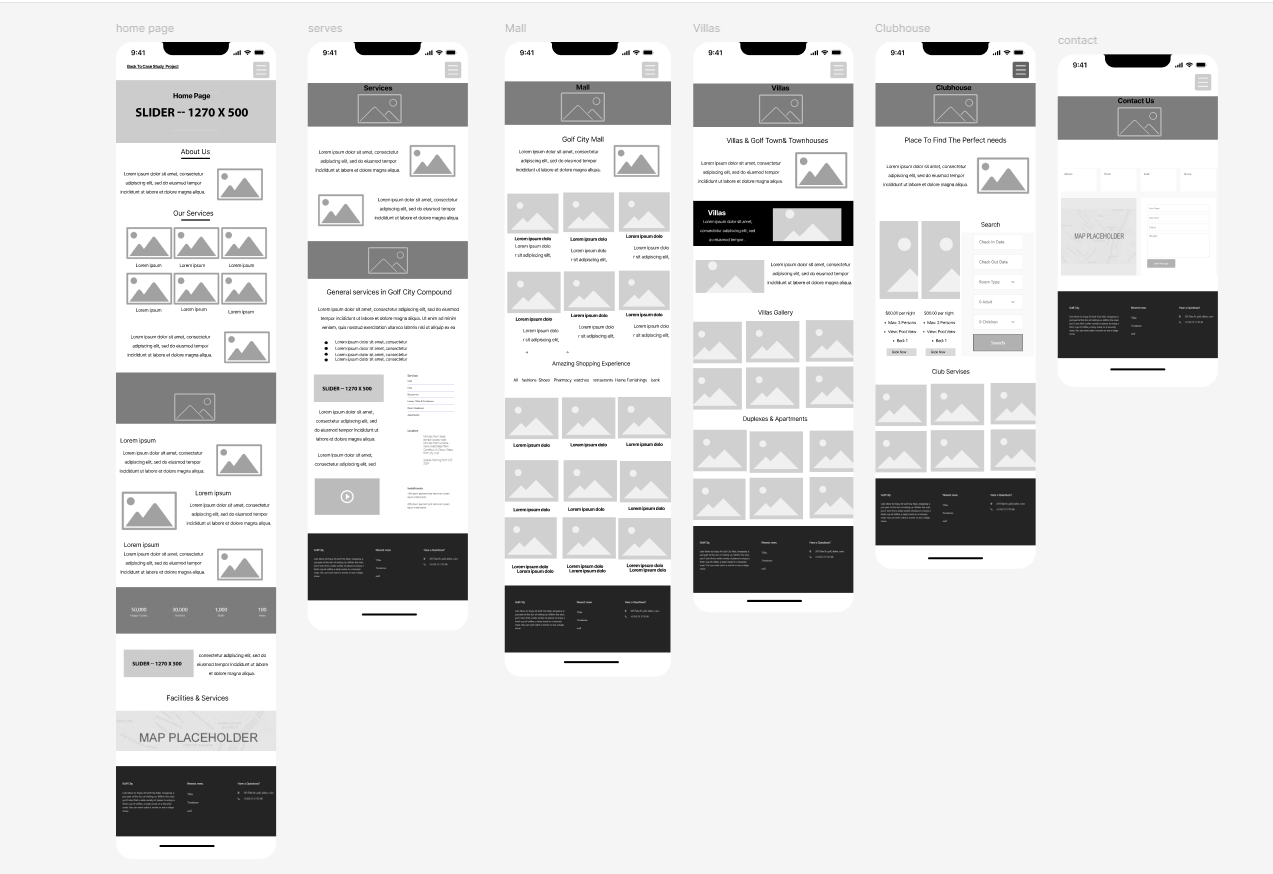
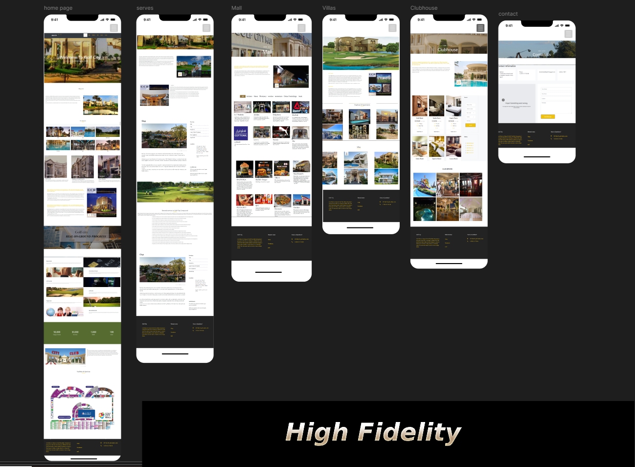
| Week 4 | UI Design & Visual Direction | – Develop moodboard/style tile- Create high-fidelity mockups (homepage, units, amenities, gallery)- Define typography, color scheme, and iconography |
| Week 5 | Prototype & Usability Testing | – Build interactive prototype (using Figma or Adobe XD)- Conduct usability testing with 5–7 users- Collect feedback and identify issues |
| Week 6 | Refinements & Final Delivery | – Implement UI changes based on feedback- Finalize responsive design for mobile/tablet- Deliver design assets & developer handoff files- Optional: Conduct A/B tests or stakeholder presentation |
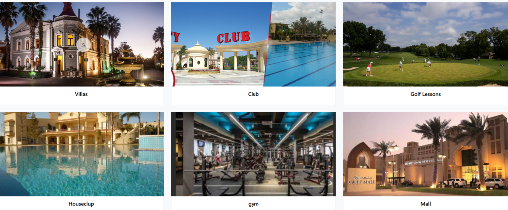
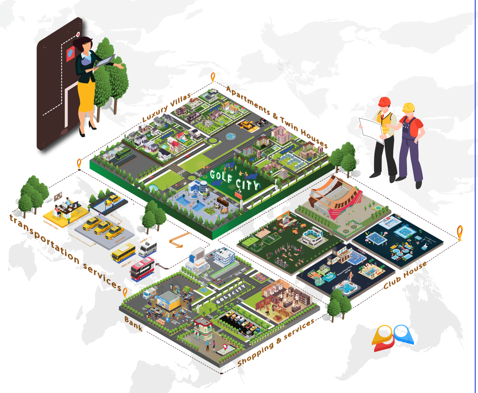
Highlight Lifestyle
Showcase the golf course, amenities, and upscale community feel.
Present Clear Information
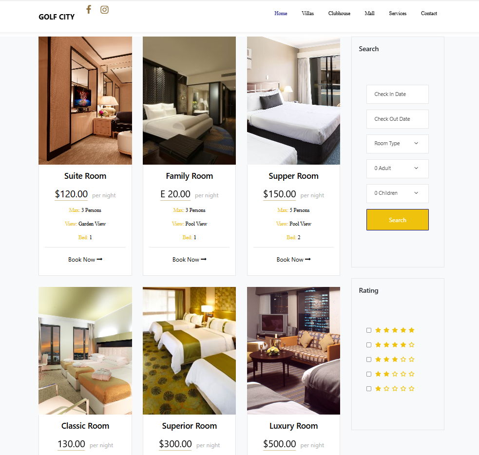
Provide details on units, pricing, floor plans, and facilities.
Improve UX & Navigation
Create intuitive, easy-to-navigate layouts with quick access to key content.
Mobile Optimization
Ensure responsive design and smooth performance on all devices.
Goal: Understand user expectations, pain points, and overall experience with real estate websites—especially luxury or golf communities.
When looking for a residential property or luxury community online, what features are most important to you?
How often do you use your phone vs. your computer when browsing real estate websites?
What would make a real estate website feel premium or trustworthy to you?
When you first land on a site like Golf City’s, what kind of visuals or information do you expect to see?
Can you describe a time when you got frustrated trying to find something on a website like this?
What kind of information do you usually look for when exploring a compound (e.g., pricing, amenities, floor plans)?
Have you ever used a real estate site on your phone and had trouble navigating or viewing content? What happened?
What would make mobile browsing easier for you on sites like Golf City?
(Use multiple choice, rating scales, or short answers)
Section 1: Website Usage
How do you usually browse real estate websites?
☐ Mobile only
☐ Desktop only
☐ Both
Which of the following features are most important when visiting a real estate website? (Select all that apply)
☐ Property listings
☐ Photos or video tours
☐ Floor plans and pricing
☐ Contact forms
☐ Community lifestyle info
☐ Mobile compatibility
Section 2: User Experience (1–5 scale)
3. The site was easy to navigate.
4. I was able to find the information I needed.
5. The design felt premium and trustworthy.
6. The mobile version worked smoothly.
7. I would consider contacting sales based on the current website.
Section 3: Open-Ended
8. What was the most frustrating part of using the website?
9. What improvements would you like to see?
Performance Metrics. Each of these dimensions was compared using best practices for UX design, with a careful focus on the extent to which each website meets its specific audience’s needs
| Stage | Madinaty | Golf City | ||
|---|---|---|---|---|
Hierarchy | Clean layout. Branded colors are consistent with the larger TMG site, but it’s crooked, needs better ui design. The website feels corporate and lacks to Madinty city information appeal. Static and text-heavy. | The design appears dated, failing to convey the luxury and modern amenities expected of a golf-centric community. It needs to be redesigned with modern aesthetics. Add visual storytelling elements (e.g., icons, interactive sliders, real-life imagery) | ||
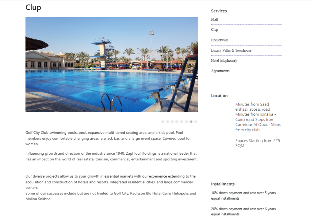
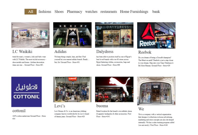
Content | The content adopts a corporate aesthetic suitable for Madinaty City. It must clearly present the project’s vision, master plan, housing details, amenities, and investment opportunities. High-quality visuals—photos, videos, and maps—are essential to showcase lifestyle and community features. Content should be regularly updated to reflect new phases, developments, and local events, ensuring relevance for both prospective buyers and current residents | Lack of content. It should focus on the lifestyle offered by a golf-centric community. This includes details about the golf course (design, facilities, membership), residential options with views or access to the course, other leisure and recreational amenities, and the overall community environment. Testimonials or news about golf events could enhance the relevance for the target audience | ||
Navigation | The navigation is shallow with minimal menu options regarding the Madinaty compound City. Essential information about the city is not available. It needs to include deeper navigation options such as units, lifestyle, and amenities. Additionally, a Quick Links section should be added for immediate access. Grouping similar content in drop-downs or tabs would also be beneficial. | Barely any navigation. No main menu or site map. The navigation needs to add a top navigation bar with categories (Home, Units, Amenities, Gallery, Contact, Booking hotel ). Include a footer with quick access links, and introduce breadcrumbs for deeper content sections. | ||
Mobile Responsiveness | Partially responsive; some layout misalignments or hidden on Smaller devices such as News, Events, and overview pages | Poor responsiveness. not optimized. | ||
Searchability | No search functionality | No search functionality |
Objective:
Evaluate how easily users can navigate the site, find key property information, and complete common tasks—especially on mobile.
👤 Participants:
5–7 users (potential buyers or renters of upscale properties)
✅ Test Tasks
Task 1: Navigation & Layout
Note any confusion due to a lack of menus or labels.
Task 2: Learn About Amenities
Task 3: Contact Sales / Book a Visit
Task 4: Mobile Experience
1. Outdated Design → Modern Visual Identity
soulution :
2. Poor Mobile Experience → Responsive, Mobile-First Design
Solution:
3. Missing Information → Clear, Complete, Organized Content
Solution: Structure and surface all critical user-focused information.
Add sections for:
Membership options
Community amenities
Upcoming golf events or tournaments
Use icons, infographics, and FAQ blocks for clarity.
Add sections for:
Use icons, infographics, and FAQ blocks for clarity.
Keep content regularly updated.
Key Fix: Introduce a clear site hierarchy and navigation system.
Add a top navigation bar with main sections: Home, Units, Lifestyle, Amenities, Events, Gallery, Contact.
Group related content in drop-down menus or tabs.
Use breadcrumb navigation and a footer with quick links.