Home depot ux case study
Case study Conclusion & Impact
- Better Usability: Users find products and services faster and easier.
- Higher Satisfaction: Increased awareness and use of key features.
- Reduced Drop-offs: Fewer abandoned carts due to navigation or performance issues.
- Improved Stability: App crashes and freezes significantly reduced, especially on older devices.
- Increased Pro User Engagement: Easier access to pro benefits encourages online usage.
Project Overview
The Home Depot app and website are recognized for their extensive product offerings and helpful digital features. However, despite these strengths, many users encounter persistent challenges that affect their overall shopping experience.
As a kitchen designer with over three years of professional experience, 1’ve had the opportunity to work directly with Home Depot customers, including contractors, homeowners, and regular shoppers. Through these interactions, I’ve observed recurring pain points and usability issues that emerge when customers rely on the app or website for project planning, product discovery, and order management.
This case study focuses on identifying and addressing those issues to improve the overall usability, efficiency, and satisfaction of the Home Depot digital experience. By analyzing user needs across different customer segments, conducting research, and proposing targeted solutions, the goal is to create a platform that is faster, more reliable, and tailored to the unique requirements of every shopper — from DIY homeowners to professional contractors.
Role: UX D & UI
Duration: 5 Weeks
Tools Used: Figma, Adobe Illustrator
Objectives
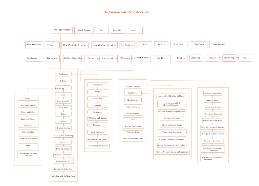
Improve Navigation and Information Architecture(Website&App)
- Create a clear, organized navigation hierarchy for both website and app.
- Ensure key sections like pro services, and product categories are easy to find.
Enhance Filtering Accuracy
Fix filter functionality to provide consistent and expected product sorting.Increase Feature Discoverability
- Promote important features such as the Visualize My Kitchen tool and pro benefits.(both App and website)
Optimize App Performance and Stability(App)
- Reduce app crashes, freezes, and slow loading times, especially on older devices and tablets.
- Improve device and OS compatibility.
Simplify Order Tracking in mobile app
- Provide clear, real-time order tracking accessible via both app and website.
Enhance User Satisfaction and Reduce Frustration
- Address pain points identified by users to improve overall experience.
- redesign app
- Revise the appliance shopping page to include more readable filters and options. Improve visibility by indicating whether products are in-store or available for delivery, and display delivery fees so users are informed about the costs
Target Users
Contractors & Professional Builders
Small to mid-size business owners, re-modelers, electricians, plumbers, and general contractors who purchase in bulk.
Homeowners
Doing Renovations People planning medium- to large-scale home projects (kitchen remodel, bathroom upgrade, flooring).
In-Store Shoppers
Customers physically inside a Home Depot store using the app to navigate.
Design thinking Prossess
1. Empathize
Understand the users, their needs, behaviors, and pain points through research, interviews, and observation
2. Define
Clearly articulate the problem based on insights gathered. Create user personas and problem statements to guide the design.
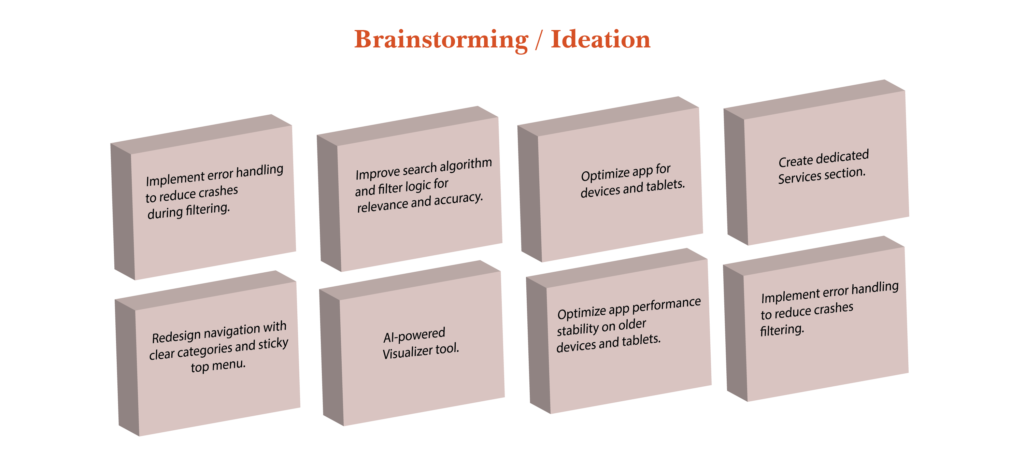
3. Ideate
Use brainstorming, sketching, and other techniques to explore possibilities.
4. Prototype
Create wireframes, mockups, or interactive prototypes.
5. Test
Gather feedback from real users interacting with the prototypes. Identify what works, what doesn’t, and refine accordingly.
Users Research
1. Qualitative Research (Interviews)
Goals: Understand frustrations, needs, and behaviors.
- How do you usually find products or services on Home Depot’s website/app?
- Have you ever struggled to locate a specific product or service? Can you describe that experience?
- What frustrations have you encountered when using the search or filters?
- How do you track your orders? Is it easy or difficult?
- Are you aware of any special features like kitchen visualization tools?
- How does the app perform on your device? Any crashes or slowdowns?
- What improvements would you like to see?
Insights:
- Users find navigation confusing, especially for services and pro products.
- Search results often irrelevant, leading to frustration and store visits.
- Many users unaware of visualization tools or DIY guides.
- App crashes and slow performance are common complaints, especially on older devices.
2. Quantitative Research (Surveys)
On a scale of 1–10, how easy is it to find products in the app?
How satisfied are you with the app’s speed and loading times?
How often do you experience crashes or blank screens?
- How often do you experience irrelevant search results? (Never, Rarely, Sometimes, Often, Always)
Which features do you use most (search, order tracking, shopping lists, DIY guides, Pro tools)?
How likely are you to recommend the app to others 1-10?
Findings:
78% rated the search experience below 3/5.
34% unaware of key features like kitchen visualization.
42% experienced app crashes in the past month.
41% prefer Lowe’s for online browsing.
Competitor Analysis: Home Depot vs. Lowe’s
Feature | Home Depot Website & App | Lowe’s Website & App | Notes / Insights |
|---|---|---|---|
Navigation Structure | Disorganized navigation services and pro products are hidden or hard to find—no sticky top navigation on website. | Clear, well-organized navigation with sticky top menu; services and pro products easily accessible. | Lowe’s offers a more intuitive and consistent navigation experience, reducing user frustration. |
Search Functionality | Search results are often irrelevant or inconsistent; filters are buggy (e.g., price sorting issues). | More accurate and relevant search results filters work reliably and intuitively. | Lowe’s search and filtering provide better product discovery and user trust. |
Product Categories & Visibility | Poor visibility of key categories like automotive and pro services; categories are buried in menus. | Prominent and clearly labeled product categories, including pro and automotive sections. | Lowe’s makes it easier for users to find specialized products and services. |
Virtual Kitchen Visualization | Exists but is poorly promoted and hard to find; users are often unaware of this feature. | Strongly promoted virtual kitchen and room visualization tools integrated into the homepage and product pages. | Lowe’s excels in feature discoverability, encouraging user engagement with design tools. |
Order Tracking | Difficult to track orders on app; limited real-time updates. | Clear, easy-to-access order tracking with real-time status updates on both app and website. | Lowe’s provides a smoother post-purchase experience. |
App Performance & Stability | Frequent crashes, slow loading, especially on older devices and tablets. | Generally stable app with faster load times and fewer crashes. | Lowe’s app offers a more reliable experience across devices. |
Pro Services & Benefits | Pro services hard to find; limited online pro account management. | Dedicated pro services section with clear benefits and easy account management. | Lowe’s better caters to professional users with tailored online experiences. |
Mobile Experience | Mobile app and website suffer from performance issues and poor discoverability. | Mobile app optimized for performance and usability features consistent with the desktop site. | Lowe’s mobile experience is more seamless and user-friendly. |
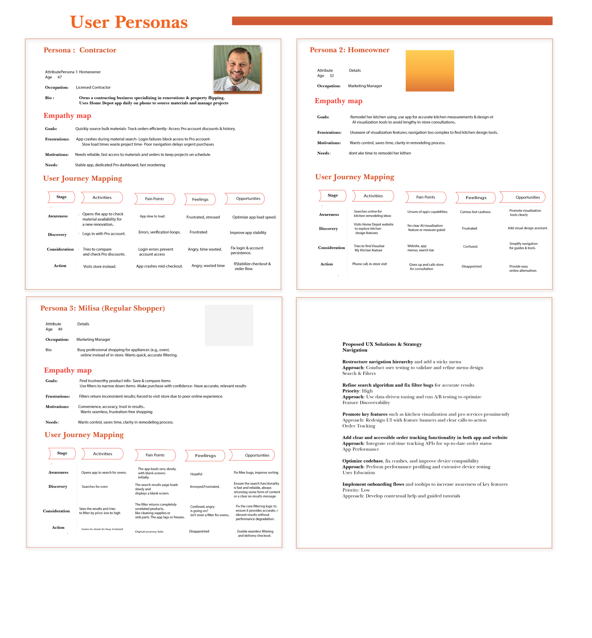
Users Personas
In brief
Particularly when it comes to virtual kitchen visualization and professional services, Lowe’s leads in terms of feature discoverability, search accuracy, and navigation clarity.
Although Home Depot has the essential features, its performance and discoverability issues irritate users.
To effectively compete, Home Depot must enhance its search and filter functionality, promote important features like virtual kitchen tools, and improve its navigation structure.
I utilized both qualitative and quantitative data by conducting in-person interviews and surveys. I carried out a total of 52 interviews and surveys with users to gather firsthand insights into their frustrations and needs. The insights gained provided measurable guidance for improvements in the redesign
Research Overview
Goal: Identify key usability problems in the Home Depot mobile app and propose improvements to enhance performance, navigation, and overall user experience.
Methods Used:
User Interviews: 10 participants (contractors, homeowners, DIYers)
Surveys: 43 respondents to quantify common pain points
Usability Testing: Task-based testing measuring completion time, success rate, and user satisfaction
Proposed UX Solutions & Strategy
Problem Area | Proposed Solution | Approach | |
|---|---|---|---|
Navigation | Restructure navigation hierarchy; add sticky menu | User testing for menu design | |
Search & Filters | Refine search algorithm; fix filter bugs | Data-driven tuning; A/B testing | |
Feature Discoverability | Promote visualization and pro services prominently | UI redesign; feature banners | |
Order Tracking | Add clear, accessible order tracking in app and site | Integrate real-time tracking APIs | |
App Performance | Optimize code; fix crashes; improve compatibility | Performance profiling; device testing | |
User Education | Onboarding flows and tooltips for key features | Contextual help; guided tours |
Key find & design solution
Key Findings & Iterations
- Clear navigation and sticky menus significantly reduce user frustration.
- Search and filter accuracy is critical for purchase decisions.
- Prominent feature placement increases usage and satisfaction.
- Performance optimization is essential for retaining pro users.
- Iterations focused on UI clarity, backend stability, and onboarding.
Final Design Solution
- A reorganized navigation bar with sticky top menu and clear categories.
- Enhanced search engine with improved relevance and reliable filters.
- Dedicated sections for pro services and DIY guides with visible CTAs.
- Prominent “Visualize My Kitchen” feature on homepage and product pages.
- Robust order tracking integrated into app and website.
- Optimized app performance with crash fixes and compatibility improvements.
- Onboarding tutorials to educate users on key features.
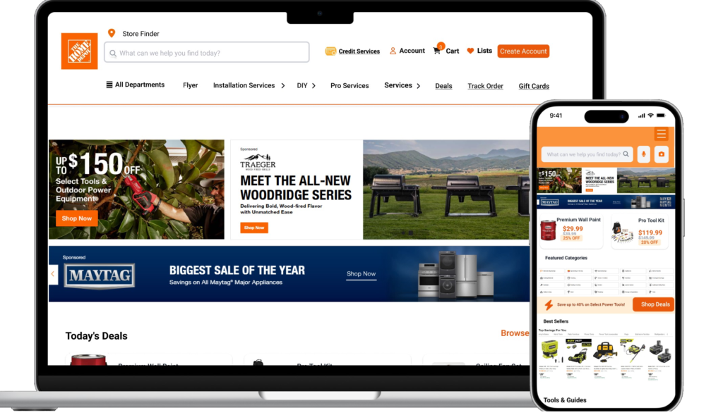
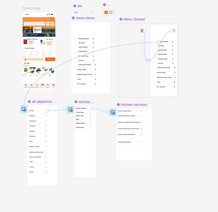
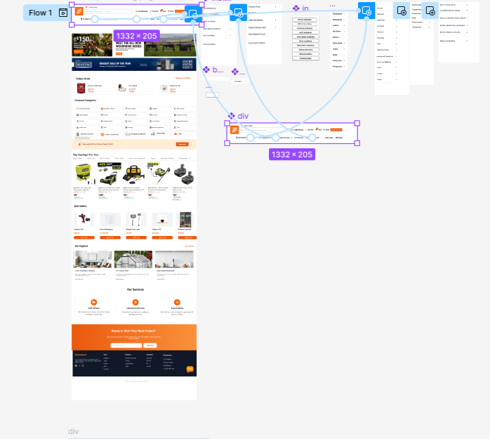
interact with links Prototype
Research Results
Metric | Before Redesign | After Redesign | Improvement |
|---|---|---|---|
Task Success Rate (%) | 55 | 77 | +22 |
Search Result Relevance (%) | 50 | 75 | +25 |
Feature Awareness (%) | 30 | 90 | +60 |
Order Tracking Satisfaction (%) | 40 | 80 | +40 |
App Crash Rate (%) | 25 | 7 | -18 |
User Satisfaction (1-5 scale) | 2.8 | 4.2 | +1.4 |
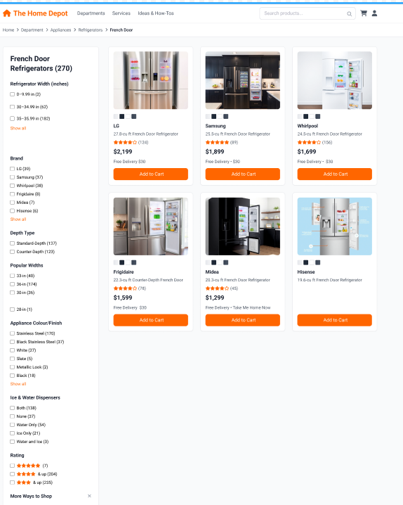
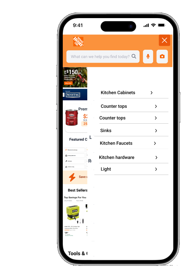
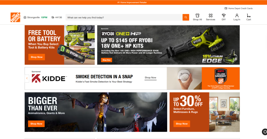
old version
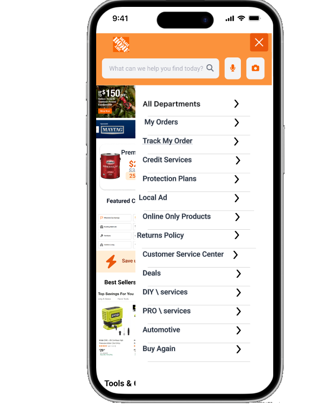
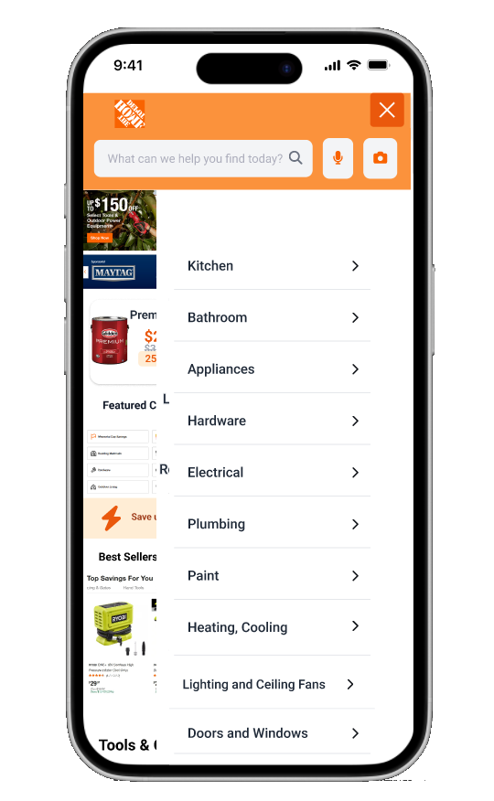
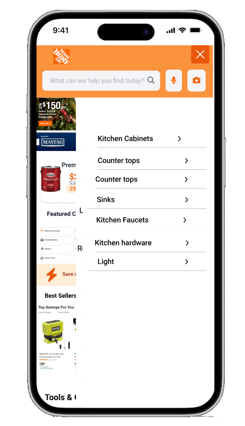
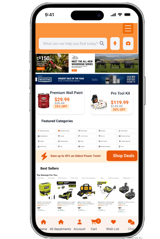
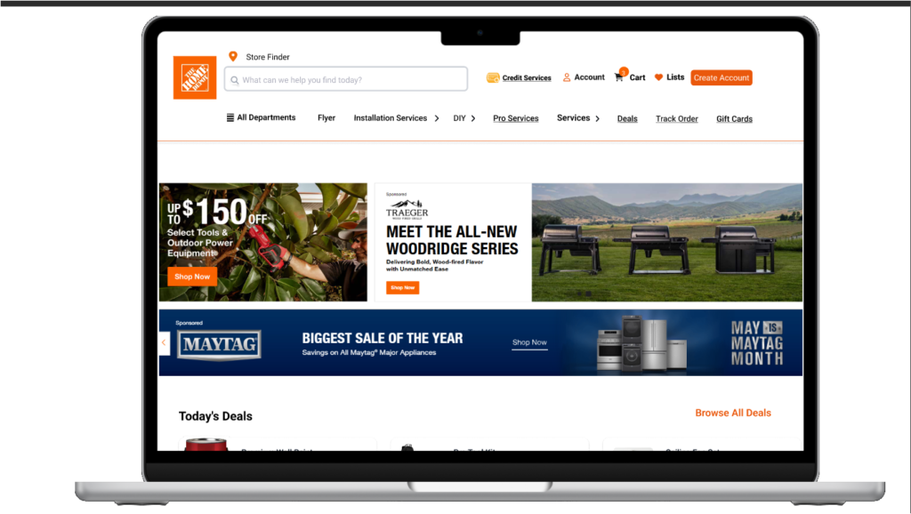
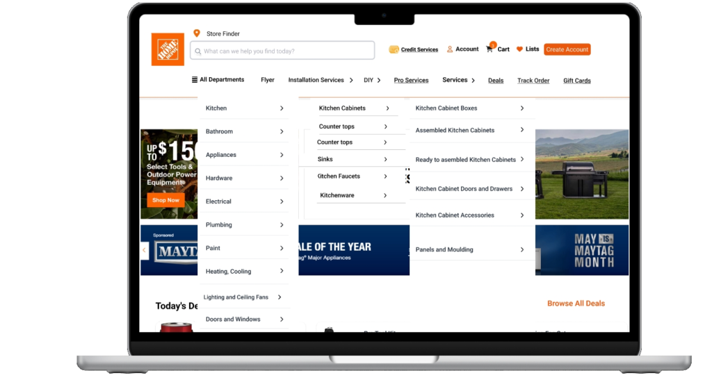
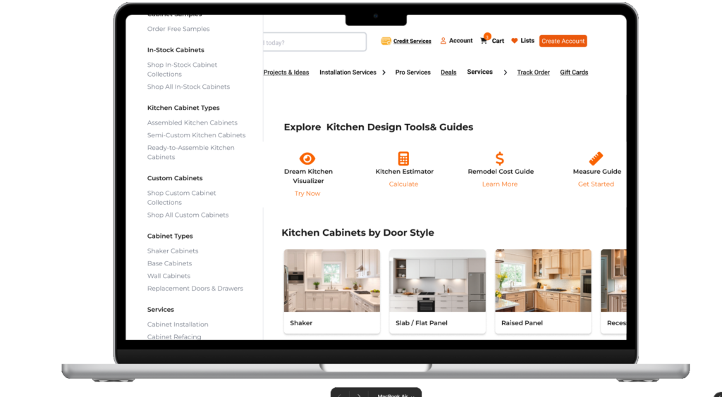
I created using figma a sticky, organized menu for easy access and better readability
c
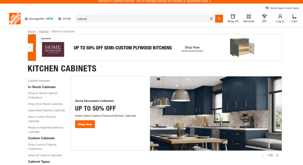
Enhanced the kitchen cabinet page with a section showcasing Home Depot’s features for better accessibility and user awareness
Old version of the page
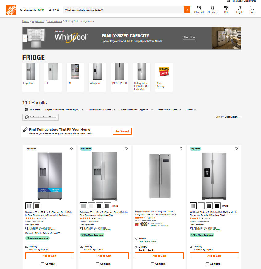
Created a more usable appliances shopping page with intuitive filters and clear delivery availability, helping users find and purchase products efficiently